From time to time I receive mails from customers stating what they love and hate about MobileKnox and DesktopKnox. I really like these mails as they give me feedback on what is good and also bad about MobileKnox and DesktopKnox. The good thing is that most customers are more than happy with my software. However, nearly all of these mails contain suggestions how MobileKnox could be improved in one way or the other. A few days ago I received a mail from a customer who did not only suggest how MobileKnox should be improved. Instead, he also scribbled a sketch how such an improvement could look like. After discussing the matter for some time with this customer I realized that he might be right.
The statement of the customer is that the user interface of MobileKnox needs a more visually appealing and usable user interface theme. By usable the customer means that it can be quite difficult to read the text presented by MobileKnox if you are in a dark environment. He also mentioned that crisp and clear structuring of some screens would be helpful. As I really like some of the sketches the customer created I added two here:
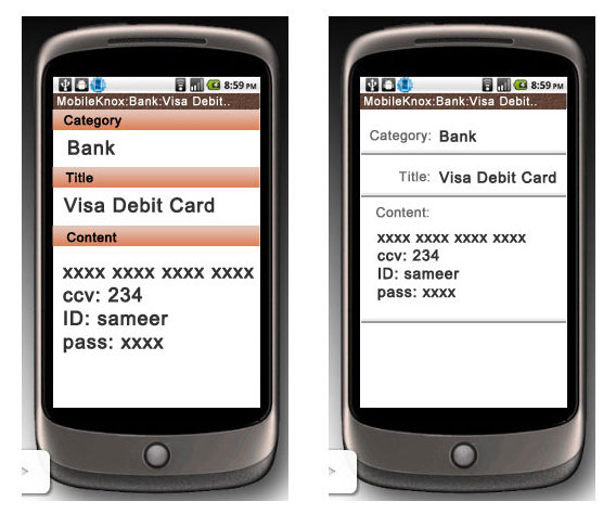
Before I start changing the colors and font sizes I would like to get more user feedback on this. What do you think about the current theme? What do you think should be changed? Which colors do you prefer? Does the structuring of the screens need an overhaul?
Your feedback is highly appreciated. Please feel free to comment about anything you think of!
Have fun using MobileKnox and DesktopKnox!
Best regards,
Thomas
Posted by Thomas King at 23:59 2011-03-03 | Trackbacks (0) | Comments (0)